New site

The new site is now up and running at http://textadventures.co.uk
Would be great to hear your thoughts!
Would be great to hear your thoughts!

Pertex
20 Apr 2013, 21:10I like this new design. Perhaps Quest needs a new logo now?
There are some points I would like to mention:
I think it would be a better look if the category pictures would have the same dimensions.
It would be great to see the type of the game (gamebook, adventure game) in the game lists.
If you click 'play online' it would be fine if the game would be started in a new tab.
And I would like to have a quick access to the forum or the wiki. Perhaps some new green buttons next to the help button?

Candacis
20 Apr 2013, 22:22Although I only knew the old design for a few days, I really like the new design. Everything looks very clean and it appears that the games will get a lot more attention due to the new design, they're more visible. 
I agree with Pertex, the category buttons should have the same length and a button to the forum, wiki and blog would be good, because now they seem to get lost at the bottom of the site.
I agree with Pertex, the category buttons should have the same length and a button to the forum, wiki and blog would be good, because now they seem to get lost at the bottom of the site.

homeeman
21 Apr 2013, 05:46I agree with Pertex about the new logo--or if not a new logo, perhaps change the colors of all those purple buttons to match one of the blues on your logo.
Category buttons of the same size would be better looking, but if for some reason you feel attached to the form-fitting buttons I think a change would really only be needed specifically for the list of categories on the right side.
I appreciate the "Windows 8" style you've got going on here. It's a very modern type thing and I'm totally into it. Overall, the new site looks awesome and I'm really excited about it.

guzmere
21 Apr 2013, 10:23Hi Alex nice polished work again as usual. I do tend to agree with Pertex about the length of the categories. By the way on the old setup page underneath the games was a section for questions asked about different games. Where has that gone? Terry Happy Adventuring.

cdutton184
21 Apr 2013, 11:45Is there a Windows 8 Start Screen vibe going on?
Anyway, the comments and reviews should be put back on at the bottom as it's a bit, should I say 'annoying', since the only way to know if someone has commented/needs help on your games is to log on into your account.
Anyway, the comments and reviews should be put back on at the bottom as it's a bit, should I say 'annoying', since the only way to know if someone has commented/needs help on your games is to log on into your account.

jaynabonne
21 Apr 2013, 14:33I'm really enjoying the new layout. It has a more upbeat feel, for some reason.
Some comments:
1) I like the nice, big squares for the games. It's quite enjoyable to browse.
2) I also like being able to focus on a particular category, viewing the best rated just for that, etc.
3) I like the Help area.
4) I agree that the category buttons need a change. That was the first thing that jumped out at me - they look like bar graphs (as in, the longer the bar, the more content), but of course it's not that way.
5) I think it's a shame that the forum is minimized. I had to search to find the link all the way at the bottom. Any chance of a link for it in the top right button area?
Overall, a fantastic upgrade!
Thanks all.
I'm not sure regular-length category badges would look any better. In fact I think it's a good thing that they kind of draw attention to themselves. If you log in to stackoverflow.com you'll see a similar tag list. Behind the scenes, categories are really tags now, so who knows what other things may appear in that list in the future. I think a skyscraper of regular rectangles would be a little dull.
I'm aiming for a minimalist approach which doesn't clutter things up with links that aren't relevant or necessary. That's why the forum is tucked away a little bit - but should still be discoverable by anybody who needs or wants it. You guys have heard of bookmarks right
Craig, if you log in and choose the "remember me" option, you'll stay logged in - and if you bookmark the Create page http://textadventures.co.uk/create you'll have something even better than a global view of all reviews/comments, as your Activity column will list all the latest reviews/comments just for your games, so it's much easier to keep an eye on them.
I'm planning to expand the functionality of the Create area quite a bit, maybe one option would be for email notifications of new activity on your games.
Pertex, yes maybe Quest is due a new logo. The current one is 11 years old now so it's lasted quite a long time. I still don't think it looks too bad so it might be nice to have something similar but a bit flatter.
jaynabonne
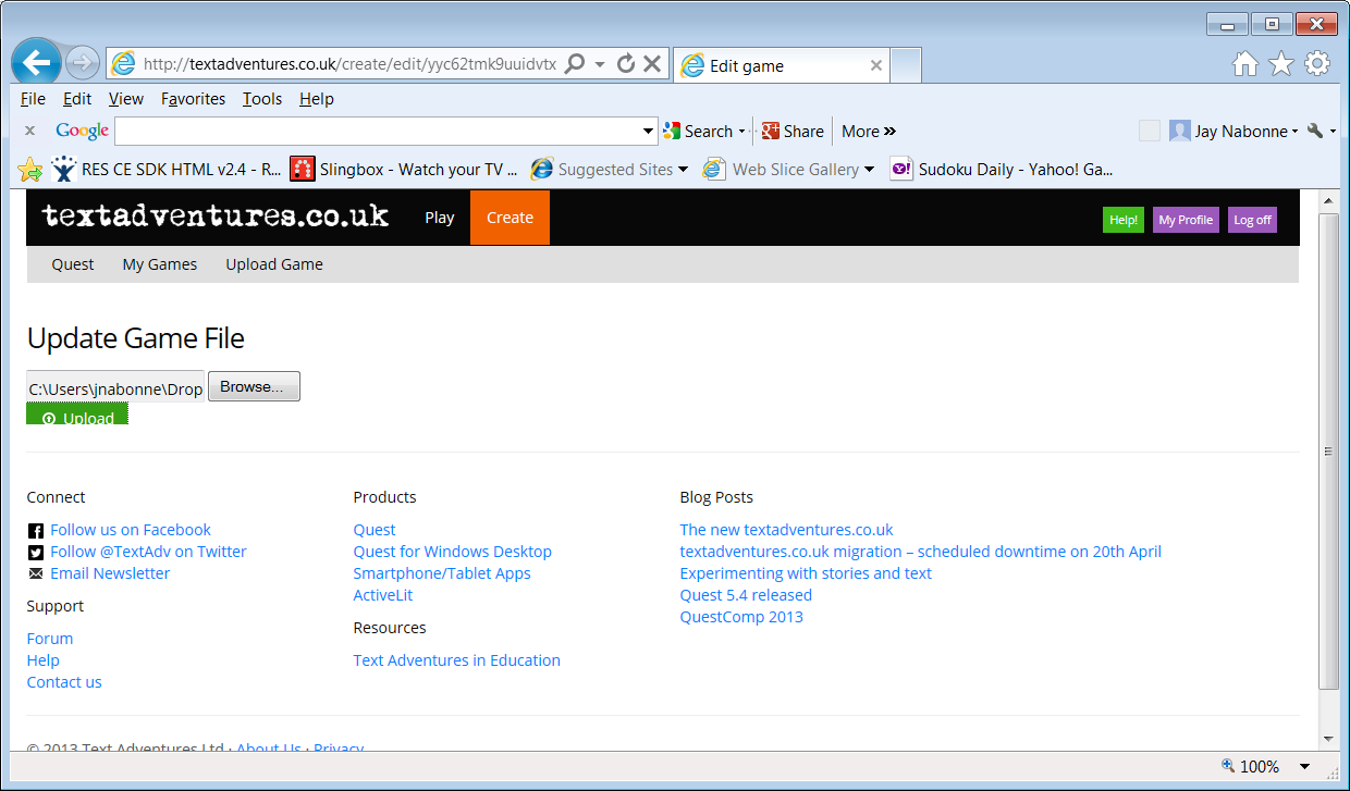
21 Apr 2013, 15:15One glitch: when updating my game (uploading a new file), a button gets clipped by the bottom panel. The button appears initially and then gets clipped when the bottom content draws. See attached,
Also, when I click "Upload", nothing visibly happend on screen. I don't know if it's designed to, but the current file I'm uploading is 10MB, so it sits unchanged for quite a while. I have to take it on faith that something is happening...
Also, when I click "Upload", nothing visibly happend on screen. I don't know if it's designed to, but the current file I'm uploading is 10MB, so it sits unchanged for quite a while. I have to take it on faith that something is happening...
jaynabonne
21 Apr 2013, 15:31Alex, as far as the forums go, I typically get to them through the Quest UI anyway (since it seems to be a constantly running these days). I just meant for new folks, to know they exist.
homeeman
21 Apr 2013, 17:08Yeah, I think jaynabonne brings up a really good point there: one of the biggest reasons I like Quest so much is this awesome community we're all a part of. Making the forums super accessible could quite possibly inspire others to stick with this hobby as well.
As for the categories buttons, I understand your point about making them pop out, but it just doesn't look quite right to me, still. I stared at it a little bit and came to the conclusion that they might benefit from a larger color palette. I'm not sure how you're implementing the buttons right now, but if they're not static pictures you might consider having the categories alternate between the different hues of blue in the Quest logo based off their current position in the stack, or perhaps completely different colors of a similar shade (although that might ruin the effect for the color blind).
It just feels a little messy as is, I think. Like someone snapped all their Legos together at one end and called it a tower.
homeeman
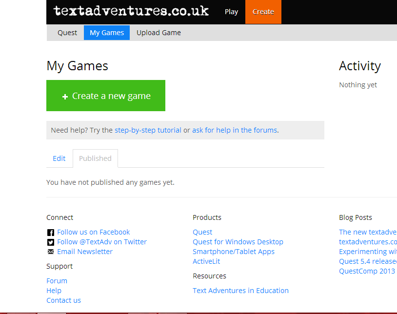
21 Apr 2013, 18:45Okay, it looks like I've found some sort of bug, as well. I went to create and clicked the "Published" tab... and there's nothing (see attached). I looked and saw that I was logged in, so I assumed the site was just experiencing a small error, but when I eventually found my game through the forums (see below for that) it appeared that the website was registering me as a user... that wasn't me. I logged out and logged back in and everything was fine, though.
This was also the first time I noticed that there doesn't appear to be a search bar on the page at all any more. Is there still a way to find specific games on the TA website? That's a big one for someone who has a game that hasn't been reviewed at all yet...
This was also the first time I noticed that there doesn't appear to be a search bar on the page at all any more. Is there still a way to find specific games on the TA website? That's a big one for someone who has a game that hasn't been reviewed at all yet...
That sounds odd. What username appeared on the My Profile page?

sonic102
21 Apr 2013, 19:33I liked the Metro-ish style. Here are some suggestions I may suggest (oops word-clash )
1. Search bar (perhaps a better one than Google Custom Search).
2. A sequel-prequel system?
3. Make a "Download Quest" button on the Create tab.
Heh heh, started exaggerating a bit, eh? But all in the intrests of humour.
1. Search bar (perhaps a better one than Google Custom Search).
2. A sequel-prequel system?
3. Make a "Download Quest" button on the Create tab.
This website is the top destination for text adventures on the web, so if you publish your game here, people will find it
Heh heh, started exaggerating a bit, eh?
@homeeman I think I worked out the problem so let me know if it happens again.
homeeman
21 Apr 2013, 20:27Thanks, Alex! Will do.
Pertex
22 Apr 2013, 07:18Alex wrote:
I'm aiming for a minimalist approach which doesn't clutter things up with links that aren't relevant or necessary. That's why the forum is tucked away a little bit - but should still be discoverable by anybody who needs or wants it. You guys have heard of bookmarks right
Not relevant or necessary? Sorry, but I think here we have different points of view. When I find an interesting site with an interesting tool I first examine the forum there. If there are no active post, I don't even check the tool. In my eyes an active community is the most important reason to use such a tool like Quest. When I found Quest (Q4) the first time, I did not install it because it was a great tool, no, I noticed in the forum that you are working on it for years. So I could be quite sure that Quest will stay alive for the next years.
And no, bookmarks do not help. Here on my pc at work the bookmarks are removed every time I start my computer and http://forum.textadventures.co.uk isn't an easy url to remember. So I usually start with quest5.net and use the link there to go to the forum. Ok, this is not a matter to change the homepage but what about creating some new redirects for quest5.net?
http://www.quest5.net should open the new homepage, http://www.quest5.net/forum loads the forum, http://www.quest5.net/wiki is already correct, http://www.quest5.net/blog --> blog, http://www.quest5.net/bugs starts the issue tracker of codeplex
Candacis
22 Apr 2013, 11:12I agree with pertex. A forum where you can ask questions, talk about the games and the software, is very helpful, especially for beginners. It can make the difference between looking for another text adventure software (or whatever you use for writing text adventures) or sticking around, learning how to use Quest.
I think the website design should reflect the importance of the community and have a visible forum button on top of the side. Also, it would be more convenient ^^
I think the website design should reflect the importance of the community and have a visible forum button on top of the side. Also, it would be more convenient ^^

davidw
22 Apr 2013, 11:17Pertex wrote:"Alex"
I'm aiming for a minimalist approach which doesn't clutter things up with links that aren't relevant or necessary. That's why the forum is tucked away a little bit - but should still be discoverable by anybody who needs or wants it. You guys have heard of bookmarks right
Not relevant or necessary? Sorry, but I think here we have different points of view. When I find an interesting site with an interesting tool I first examine the forum there. If there are no active post, I don't even check the tool. In my eyes an active community is the most important reason to use such a tool like Quest. When I found Quest (Q4) the first time, I did not install it because it was a great tool, no, I noticed in the forum that you are working on it for years. So I could be quite sure that Quest will stay alive for the next years.
And no, bookmarks do not help. Here on my pc at work the bookmarks are removed every time I start my computer and http://forum.textadventures.co.uk isn't an easy url to remember. So I usually start with quest5.net and use the link there to go to the forum. Ok, this is not a matter to change the homepage but what about creating some new redirects for quest5.net?
http://www.quest5.net should open the new homepage, http://www.quest5.net/forum loads the forum, http://www.quest5.net/wiki is already correct, http://www.quest5.net/blog --> blog, http://www.quest5.net/bugs starts the issue tracker of codeplex
Have you tried copying your Bookmarks into a Word document? That way, you could have your own Bookmarks list without having to rely on the one in the browser.

Thierry
22 Apr 2013, 11:37I agree with Pertex and Candacis... I started with Quest one year ago. I didn't know anything about scripts, functions, etc., and the community here really helped me (especially Pertex and Jaynabonne, thank you guys). Honestly, I think I wouldn't have used Quest more than a few days if the forum wasn't active as it is 
There is at least one link to the forum on every single page on the site. In the Create area there is also a prominent link.
davidw
22 Apr 2013, 13:00I agree the link to the forum needs to be more prominent. One of the main complaints about the forum on the ADRIFT site when I first started using it years ago was that some people never even realised there was a forum because the link wasn't clearly displayed. Other people only managed to find it via a Google search.
Pertex
22 Apr 2013, 13:28davidw wrote:
Have you tried copying your Bookmarks into a Word document? That way, you could have your own Bookmarks list without having to rely on the one in the browser.
Hej, great idea! Thanks!

My thoughts on the new site
Likes - 1st impressions - very eyecatching and plenty to look at.
- The games are certainly more prominent and easier to navigate.
Dislikes - Difficult to find links to forums, documentation, etc as they are "hidden" within text at the bottom. (I prefered the dropdowns across the top in the previous site.) Navigation should either be via a menu on the side or top of the page.
- haven't yet found how to save a file I've been working on from my PC to the web editor.

sgreig
23 Apr 2013, 06:17If it were me, I would put a small button to the forum in the top right of the site by the help/My Profile/Logout buttons if I was going to put it anywhere. Then it's more prominent than it is now, but it's not in your face either. Just my 2 cents though. My browser has autocomplete so all I have to do is type "fo" in my address bar and it fills the rest in for me.
R2T1 wrote:haven't yet found how to save a file I've been working on from my PC to the web editor.
This isn't implemented yet - the ability to download from the web editor to your PC is new though, so it does make sense for me to implement the other direction at some point!
Thanks Alex,
That explains why I couldn't find how to do it.
That explains why I couldn't find how to do it.
sonic102
24 Apr 2013, 20:02One more thing: Where is the download Quest button?
Pertex
06 May 2013, 14:39Hi Alex,
when updating a game file, it partially hides the upload button and the link
when updating a game file, it partially hides the upload button and the link